Keep your DNA, not the default
Menus, food photos, posts and illustrations made with default generators are starting to look alike. Why that costs a brand its character, and how to keep it.
Walk through any city centre or scroll any feed and a new kind of sameness shows up. The burger with the impossible gloss and the warm orange glow. The menu with a grid of dishes that all share the same light. The post illustrated with rounded, faceless figures on a purple gradient. You have seen them before, even if you have never seen these particular ones.
They are what a default generator makes when nobody tells it anything else. Each one, alone, looks fine. Together, they look like nobody.
The menu that serves nothing
In September, NBC News reported on AI generated food pictures moving from social feeds onto real menus and shopfronts: shrimp that looked like miniature life preservers, a breakfast burrito with a filling from a horror film, and a café menu advertising a dish that did not exist. The reasons are easy to understand. Image tools are cheap or free, and a photographer is not. Many of the businesses are small and working on tight budgets.
The reaction was harsh. People mocked the pictures online, and in Wyoming the Chugwater Soda Fountain posted a sign promising no AI flyers or photos. The post drew 119'000 likes. When a promise of no AI starts to work as a selling point, every brand that thinks the default is good enough should take note.
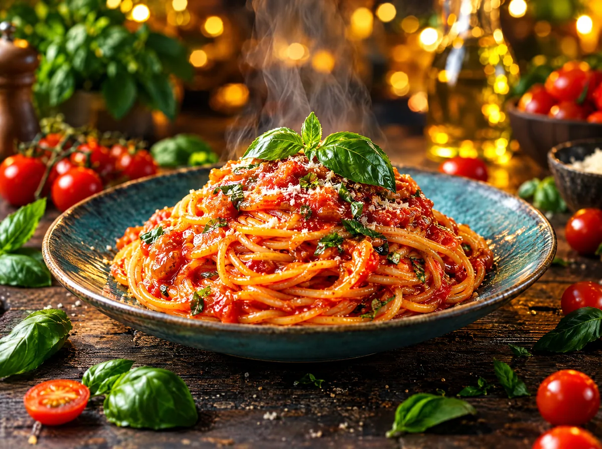 Default
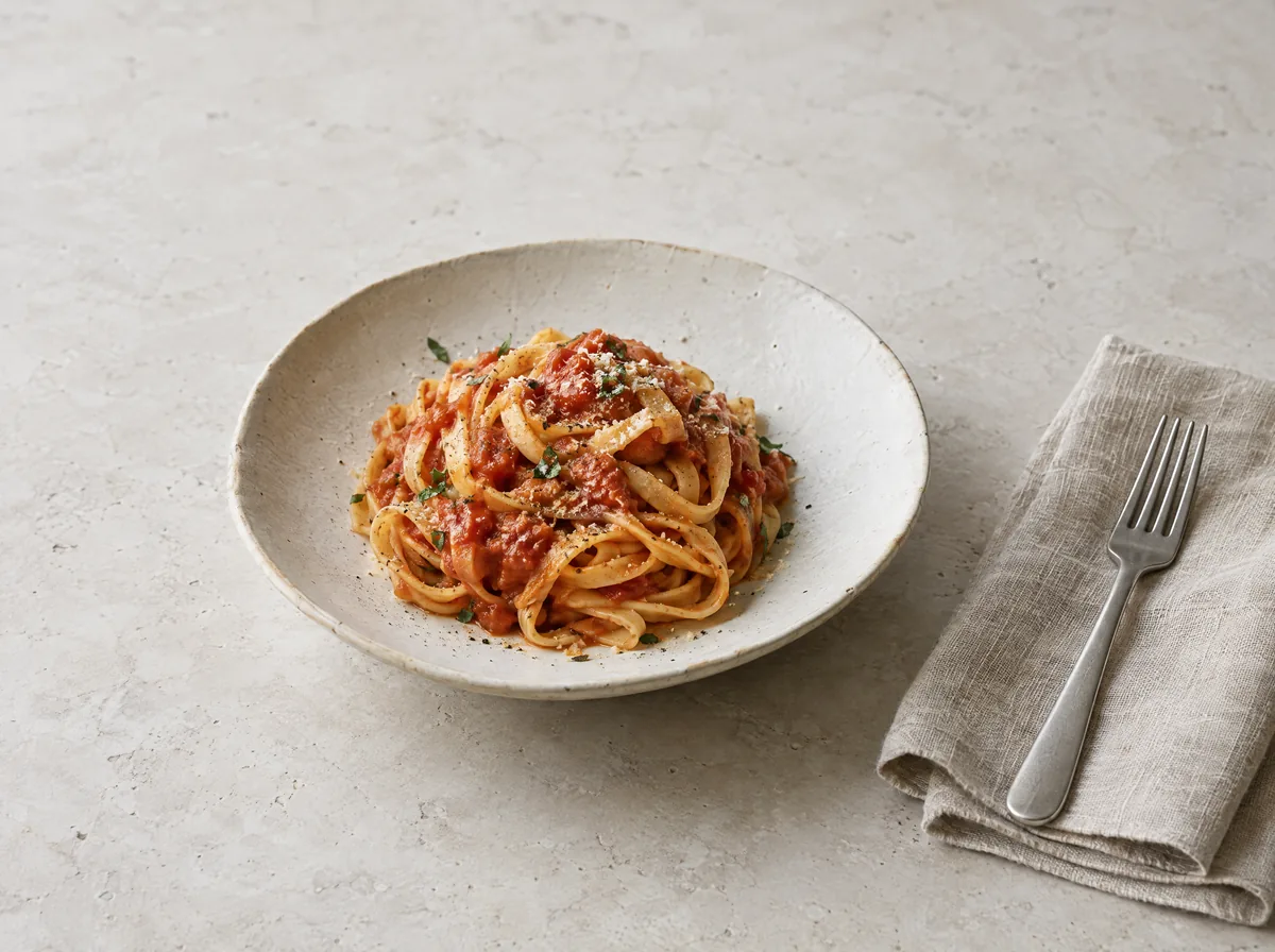 Locked style
Why defaults look alike
This is not bad luck. It is how the models work. A model trained on everything produces, without direction, the most probable version of what it has seen. Anthropic's applied AI team described the effect plainly last November, when it explained why its own model, left alone, designs the same websites: safe choices that work everywhere and offend no one dominate what it learned from, so the output converges on them. Users, they wrote, call the result the AI slop aesthetic, and they named the usual suspects, generic fonts such as Inter and purple gradients on white.
Images behave the same way. In a study published in the journal Patterns last December, researchers let an image model and a captioning model feed each other in a loop, 700 runs of 100 rounds each. Every run drifted towards a few generic motifs, stormy lighthouses and palatial interiors among them, which the authors called visual elevator music. They suspect the missing ingredient is the corrective pressure of human interaction.
Words drift too. Researchers at Cornell asked people in India and the United States to write about their own culture, half of them with an AI writing assistant. With the assistant, the two groups wrote more alike, mainly at the expense of Indian writing styles, and the suggestions for favourite foods and holidays ran to pizza and Christmas.
What a brand loses
A brand is recognised by what it does differently and repeats: a colour, a crop, a kind of light, a way of saying things. That is its DNA. A default generator has a DNA too, and it shares it with everyone who uses it. Every time a company publishes the default, it lends its name to someone else's look.
The loss is slow, which makes it dangerous. One generic post changes nothing. A year of them teaches the audience that the company could be anyone. For a company that works in several languages, the drift is double: the pictures start to look like everywhere, and the words start to sound translated from an English nobody in the company speaks.
Clever prompting alone does not fix it. In a classroom experiment at Syracuse University, described in a report with Ipsos this year, students used prompts and reference photos to make ads about themselves, and still could not escape what the authors called AI's tendency to “flatten creativity into something predictable and uniform.”
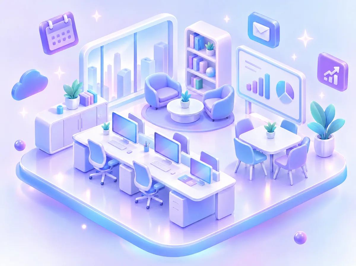 Default
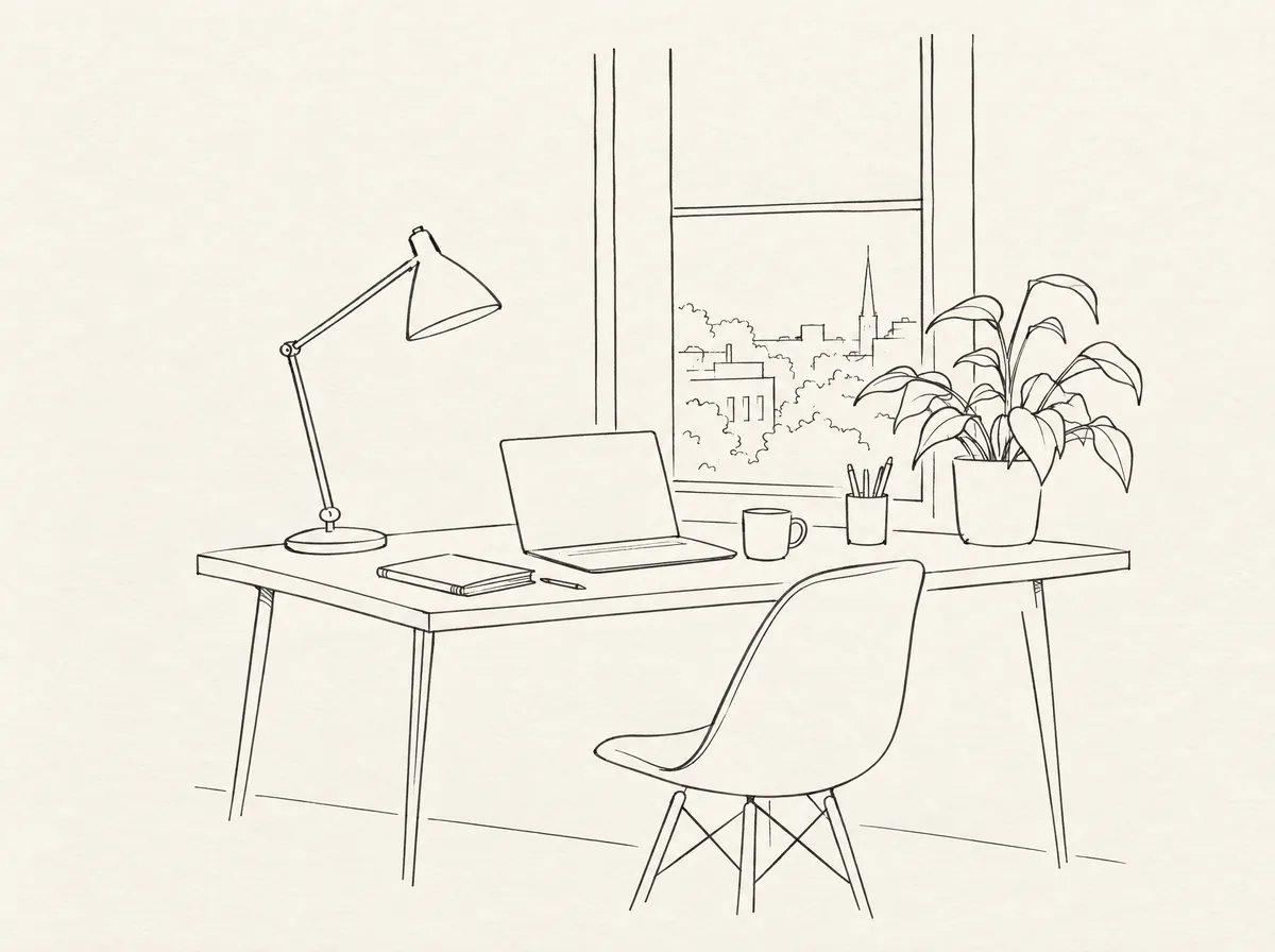 Locked style
How to keep it
Four things keep a brand's DNA intact when the making is done by machines.
References. Real pictures of your products, your rooms, your people and your light, chosen because they show the best of you. A reference shows a model what words cannot describe.
A locked style. A reference is a starting point, a recipe is a decision: the light, the lens, the set, the palette, the grain and the crop, written down and tested until someone approves it. Reel builds every style this way, from real references, so the hundredth picture still looks like the first.
A brand pack. The colours, the type, the voice, the words you use and the ones you never use, and what the product must always look like. In Twin, those rules and that voice are part of the company's AI brain, so the assistants work inside them instead of guessing.
A person who picks. The machine makes the options, a person chooses. In Reel, a person picks every image and every clip that is used, and every pick teaches the next batch. That is the part we would never hand over. The speed, the variants and the formats can come from AI. The taste, the judgement and the responsibility for how a brand shows up stay with the people who own it.
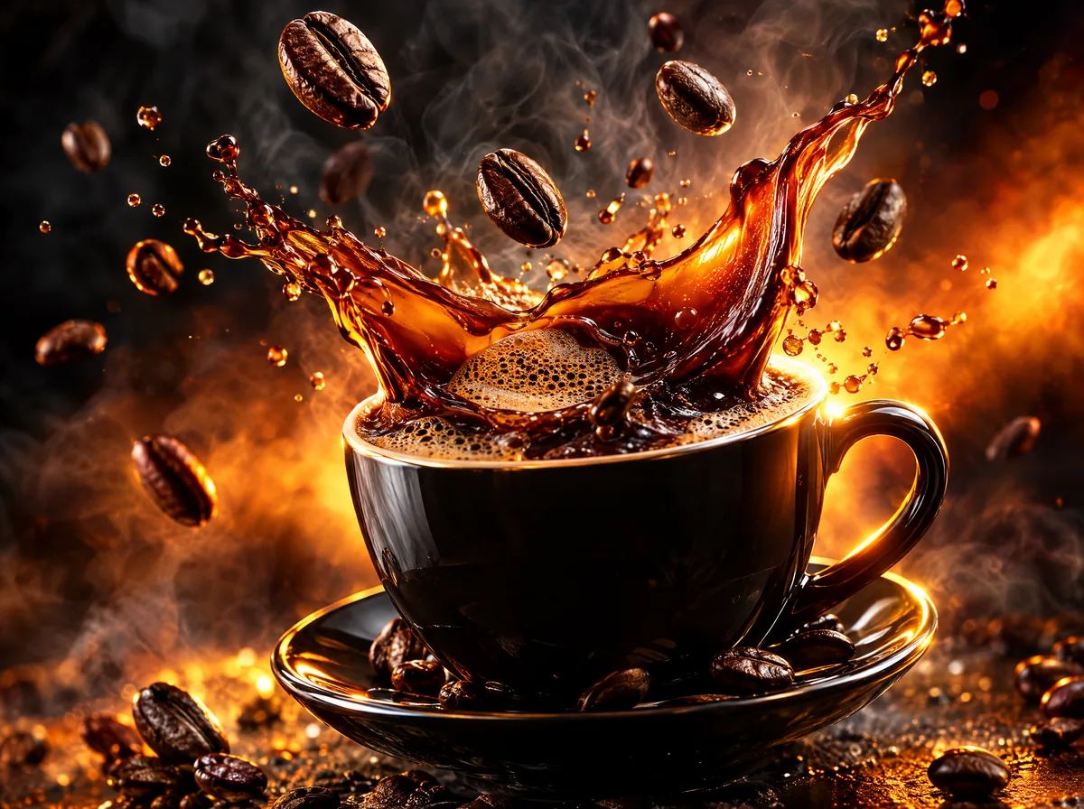 Default
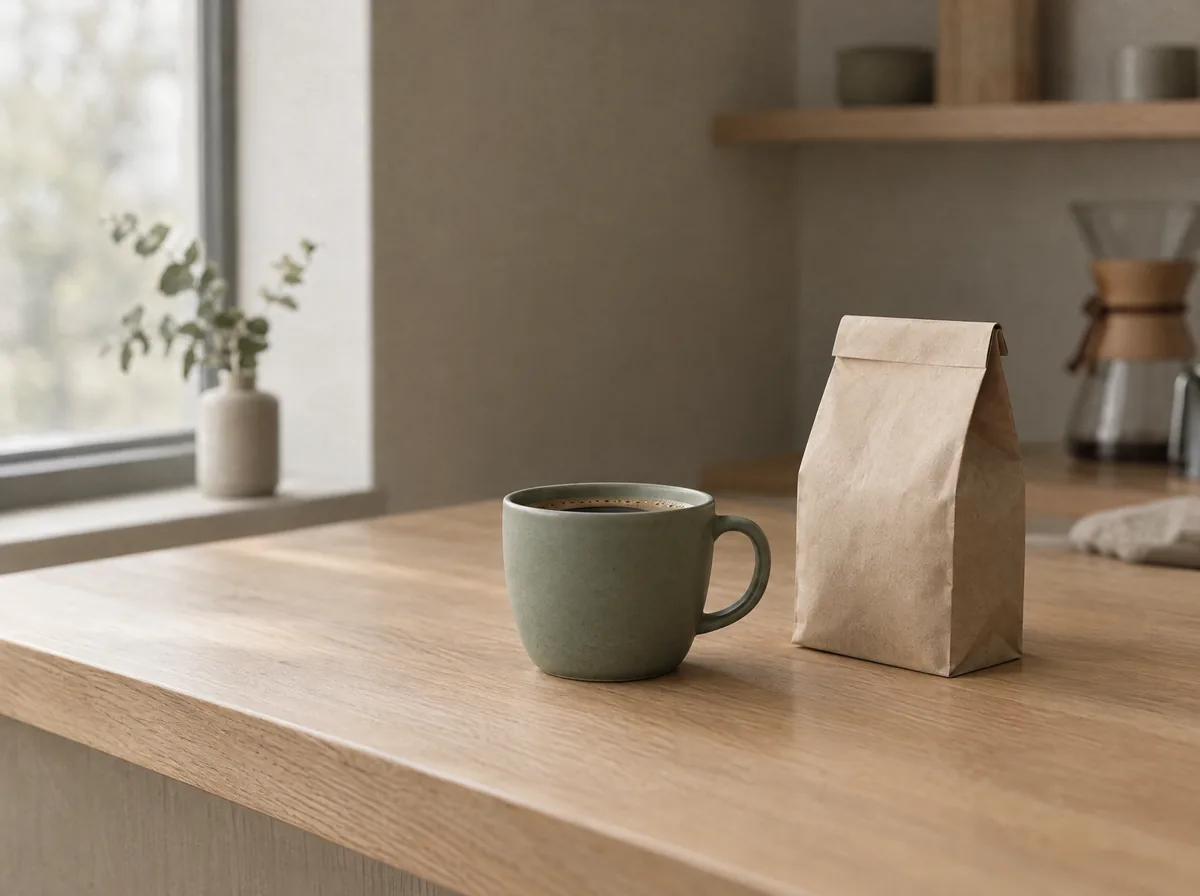 Locked style
What a company can do
Look at the last twenty things you published and cover the logo. If you cannot tell they are yours, neither can your customers.
Then start with what you already have: your best photographs, your best texts, and the rules that live in people's heads. Write them down once, lock the styles that matter, and make one person responsible for the picks. When a picture is generated, keep the original photograph one click away.
The default will keep improving, and it will keep looking like the default. Your DNA is the part nobody else can generate.